In this post, we’re going to break down the three major color systems you need to understand: RGB, CMYK, and Pantone. Whether you’re designing your own materials or working with a professional, understanding color for stationery and signage will help you make smarter, more confident choices—before anything goes to print.
Have you ever chosen a beautiful color on your screen—only to see it print out looking dull, washed out, or totally wrong? If so, you’re not alone. This color mismatch is one of the most common frustrations in design and printing, especially when you’re working on something as personal and polished as wedding stationery or event signage.
The issue comes down to color systems. Your screen and your printer speak two very different languages. And when they try to translate each other? That’s when things get tricky.
RGB: What You See on Screen
What Is RGB?
RGB stands for Red, Green, and Blue. This is the color system used by all digital screens—your phone, computer monitor, TV, and tablet.
Screens work by shining light through tiny red, green, and blue pixels. By adjusting the brightness and overlap of these lights, they can create millions of colors.

The Result
Because screens use light, not ink, RGB colors often appear brighter, more saturated, or even neon or glowing.
That’s why your digital mockups or Pinterest inspiration boards seem to “pop” so much. You’re looking at colors made from light—not physical pigment.
The Downside
Here’s the catch: RGB doesn’t exist in print. Printers can’t use light. They rely on ink. And ink has limitations. So when it’s time to take your gorgeous screen design to paper, some colors simply can’t be recreated.
The result? A noticeable shift—especially with vibrant blues, purples, or oranges. They might print duller, darker, or with a different hue entirely.
CMYK: The Standard for Digital Printing
What Is CMYK?
CMYK stands for Cyan, Magenta, Yellow, and Black. This is the color system used in most digital and professional printers, especially for stationery and signage.
CMYK is a subtractive color model. Instead of mixing light, it mixes ink. The more colors you layer, the darker the result. These four inks combine in thousands of tiny dots to create full-color images on paper.

Why It’s Common in Printing
CMYK is cost-effective, widely available and perfect for short runs or custom designs.
This makes it ideal for printing invitations, menus, seating charts, welcome signs, and other event pieces.
The Downside
The main issue with CMYK is its limited color range compared to RGB. Some screen colors are simply too vivid or luminous to replicate with ink.
That’s why your dusty lavender might turn gray, or your electric coral might look more salmon than expected.
Also, keep in mind:
- The type of paper affects how ink absorbs. For example, uncoated paper absorbs ink less than coated paper, but coated paper leaves a glossy finish which might not be ideal for your design.
- Printer calibration can cause shifts.
- Even temperature and humidity can make a difference!
So while CMYK is reliable and cost-effective, it doesn’t guarantee perfect color accuracy.
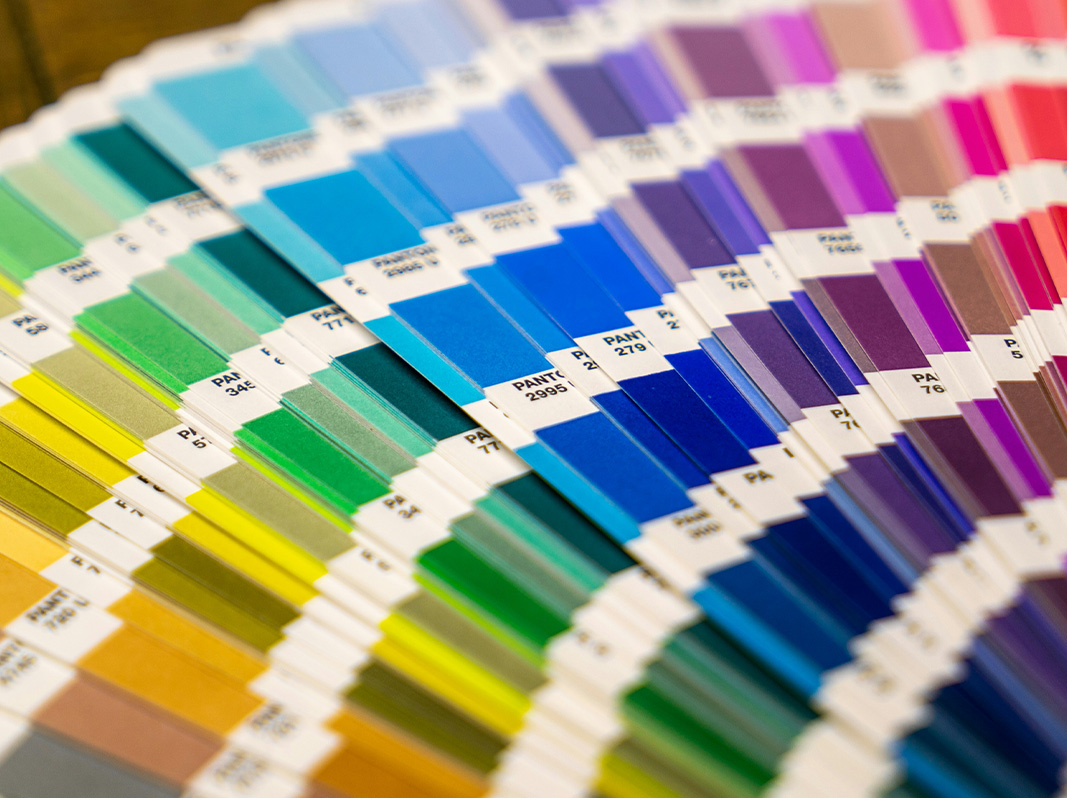
Pantone: When Exact Color Matters
What Are Pantone Colors?
The Pantone Matching System (PMS) uses pre-mixed ink colors. Each color has its own specific formula and ID number, like Pantone 186 C (a bright red) or Pantone 320 U (a soft teal).
Unlike CMYK, where the printer blends colors on the spot, Pantone colors come as ready-to-use inks—so what you see is truly what you get.

Why People Love Pantone
Pantone is the go-to choice for branding, logos, and luxury printing.
Pantone printing ensures the exact same color prints every time, no matter the paper, press, or location. This is especially important for understanding color for stationery and signage when consistency across pieces matters.
To learn more about Pantone colors, watch this video.
The Trade-Off
Pantone printing is usually done with offset printing, screen printing, or letterpress. These are specialty methods that cost more than standard digital printing.
Because the ink is custom-mixed and applied separately, there’s more setup involved—and that means a higher price point, especially for short print runs.
Which Color System Should You Use?
Understanding color for stationery and signage ensures your vision shines through—exactly how you imagined it, with no surprises.
If you’re looking for a cost-effective print method, digital printing with CMYK colors is the way to go.
If you’re open to spending more for a higher quality result, consider speciality printing like letterpress, offset printing, or screen printing.
Work With a Professional
If you’re ready to create wedding stationery and signage, consider working with a professional who can help guide you through these decisions, as well as decisions about all the different print methods, materials, embellishments, and more.


