Many wedding details appear decorative at first glance, yet the best design choices always serve a clear purpose. Wedding placement cards are a perfect example of this balance. They guide guests to their seats while contributing to the overall design of the tablescape.
When I design wedding stationery, I consider both aesthetics and experience. Placement cards must fit with the overall wedding aesthetic, yet they must also perform an important role. Color, material, size, font size, shape, and placement all matter.
In the sections that follow, I will walk you through the purpose of placement cards, essential design principles, material choices, and styling ideas. With thoughtful planning, this small detail becomes an integral part of the guest experience.
The Purpose of Wedding Placement Cards
The purpose of a placement card is twofold. It provides clear direction for guests while quietly supporting the catering logistics and rhythm of the evening.
Assigned Seats
Assigned seating creates structure and supports a more intentional guest experience. Guests typically begin at a seating chart or escort display, where they find their table number, then move to find their table where a placement card indicates their exact seat. This layered flow keeps movement efficient and prevents congestion at tables.
Assigned seats are especially useful for more structured receptions. For example, they are often used when:
• you want to thoughtfully group guests
• formal dining service is planned
Supporting Catering Logistics
Placement cards also play an important role behind the scenes.
For some weddings, guests can select an entrée among several options when they RSVP. Accommodating dietary restrictions and allergies is also a must. Without a clear system, servers must confirm each guest’s choice before delivering the dish. This slows service and interrupts the natural rhythm of dinner. For a formal wedding, this makes the service appear less organized and less impressive.
Placement cards provide a simple solution. Subtle visual indicators allow the catering team to identify meal selections or dietary restrictions quickly while remaining discreet for guests.
Common solutions include:
• icons on place cards that represent the allergy or dietary restriction
• color-coded place cards that indicate the meal selection
These cues allow servers to move confidently through the room without having to interrupt guests with questions.
3 Design Fundamentals
Each decision should support function first, then enhance the visual harmony of the tablescape. When I design wedding placement cards, I focus on three foundational elements: the typography, the material, and the placement.
1. Typography
Legibility remains the most important factor in placement card design. Guests should recognize their name instantly as they approach the table. Even the most elegant typography loses its value if it slows the seating process.
Highly ornate scripts, very thin serifs, or hand-drawn typography can be difficult to read, especially when guests search quickly for their name.
When designing place cards, I balance the typeface, the font (light, regular, bold, etc.), the spacing between letters, and the line height (if first names are on one line and last names are on another line).
Font Size
Even with the right typeface, the place card can be illegible if the font size is too small. Guests shouldn’t have to lean forward or scan several cards before finding their place.
As a graphic designer, I know how to balance the size of the place card with the correct font size so that the names appear clearly for guests and in photos of the tablescape. The result feels effortless for guests.
Color Contrast
Lighting conditions vary widely across venues. Many receptions take place in softly lit spaces that rely on candlelight or warm ambient lighting. In this case, designs that may appear beautiful in daylight become difficult to read during dinner. Before I start designing your place cards, it’s important for me to understand your tablescape and your venue.
Strong contrast ensures visibility no matter the lighting or how far the guest is standing. This means understanding the contrast between the text and background colors by using accessibility tools to ensure that each pairing has the appropriate contrast ratio.
Size and Proportion
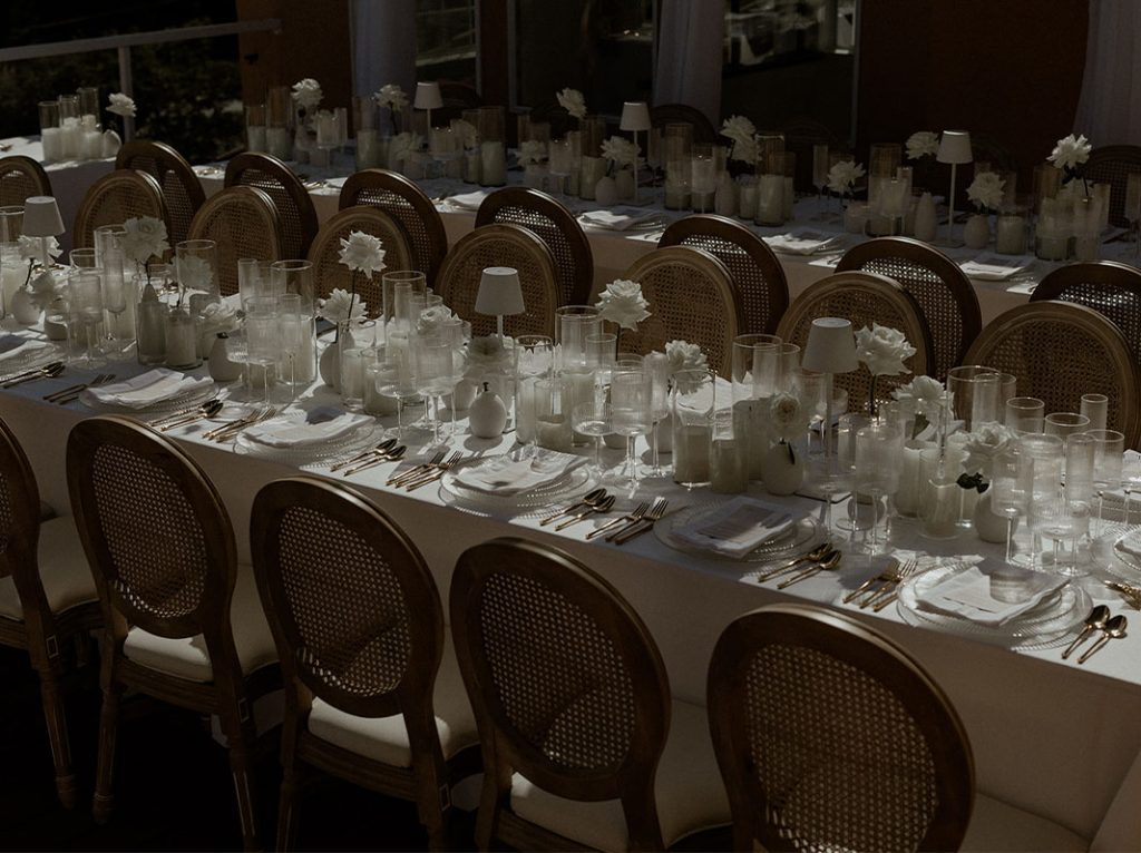
Placement cards should feel balanced within the overall tablescape and the size of the table. Their size influences both appearance and function.
If the cards are too small, guests may struggle to read them. If they are too large, they can dominate the table and compete with other elements, such as the dinner menus. Thoughtful proportion creates visual harmony.
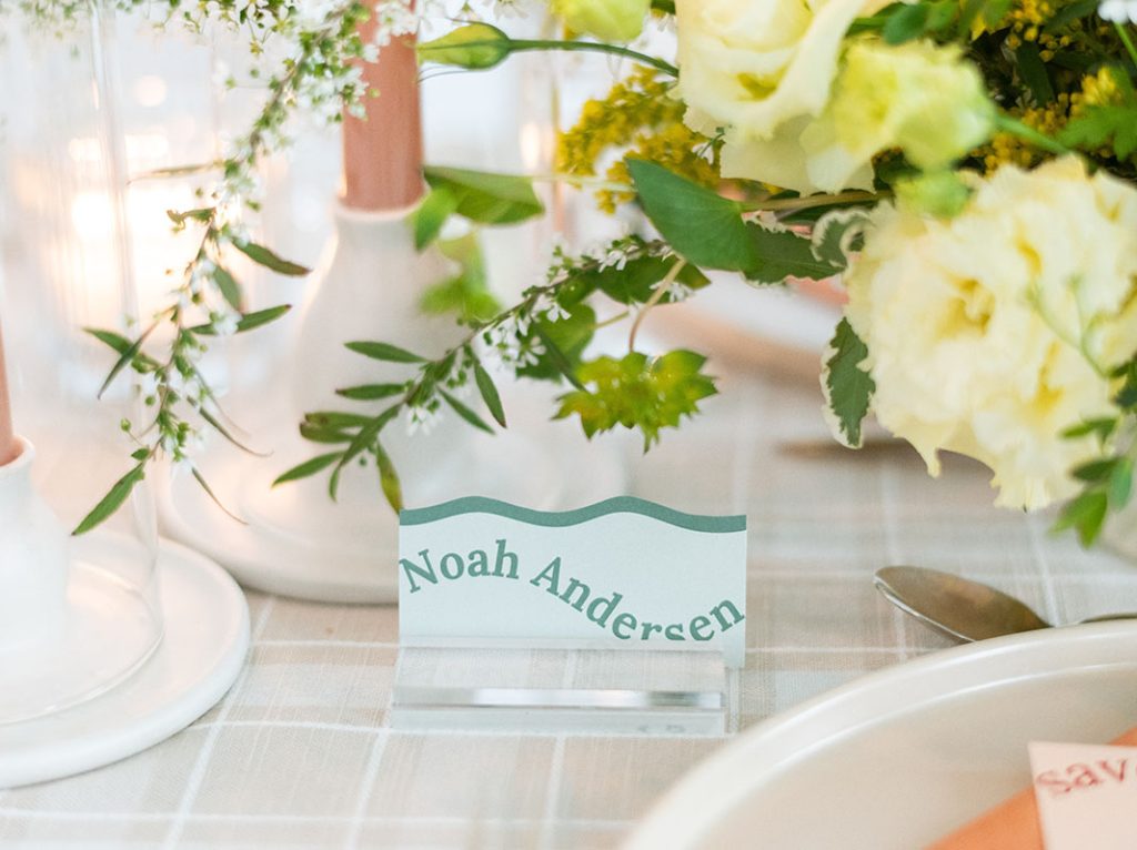
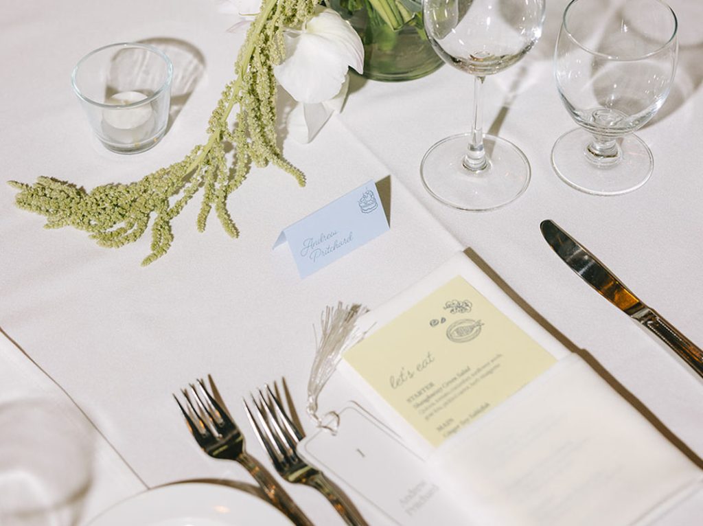
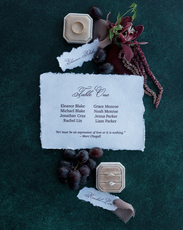
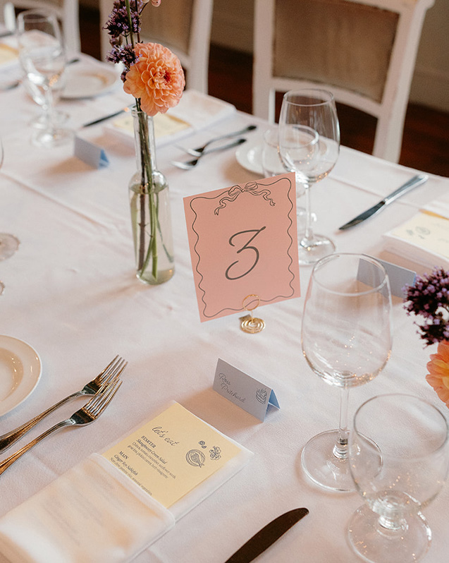
Most placement cards follow similar formats that work well across many table styles. These include folded tent cards that stand upright and flat cards placed directly on the table or on the menu.
Tent cards offer strong visibility from several angles. Guests can read them easily as they approach the table. These also look great in photos.
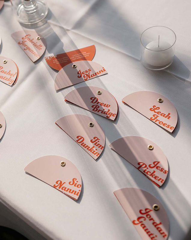
Flat cards allow you to have much more design flexibility and the option to play around with different shapes, sizes, and materials. Their placement on the table is key for visibility while not overcrowding the tablescape or clashing with other decor.
2. Material Choices
Different materials create different results. Some add texture, while others add structure. Guests often notice the material and the design before they even read the name. A few common materials are listed below. To learn more about material options, read this blog post.
Cardstock
Cardstock remains the most versatile and cost-effective choice. It offers a wide range of textures, colors, and finishes.
Several printing techniques enhance cardstock placement cards:
• letterpress for a deep tactile impression
• foil stamping for metallic detail
• soft-touch lamination for a smooth and matte finish
Acrylic
Acrylic placement cards create a sleek and modern presence. Names can be printed directly with UV printing or applied with vinyl lettering. This material works beautifully with contemporary or minimalist designs.
Wood
Wood placement cards introduce warmth and natural texture. They feel particularly appropriate for outdoor venues or garden settings. The natural grain adds subtle variation to each piece. With wood place cards, names can be printed with UV printing or applied with vinyl lettering.
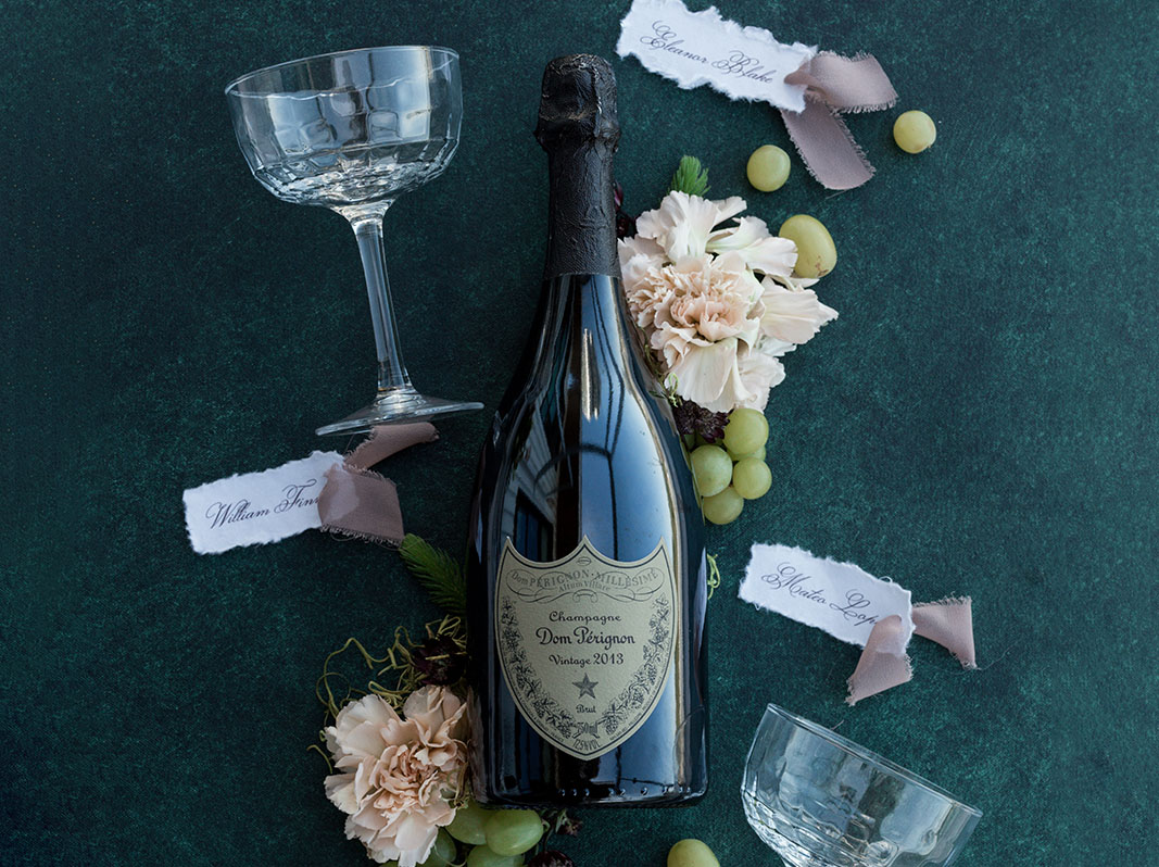
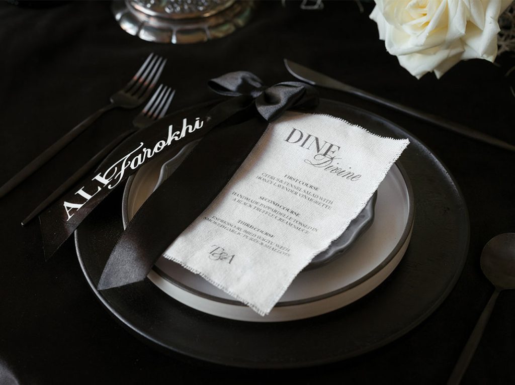
Ribbon
Ribbon placement cards offer a soft and romantic presentation.
These place cards are created by using heat transfer to add vinyl lettering on the ribbon. The ribbon can be wrapped around napkins, menus, or small favors. This approach adds movement and dimension to the place setting.
Marble or Stone
Marble surfaces create a sculptural presence on the table. These materials feel substantial and refined. Many guests keep them as small mementos after the wedding. For these place cards, names can be added with UV printing or vinyl lettering.
Objects
Placement cards can also be created out of small decorative objects.
Examples include:
• seashells
• keychains
• bookmarks
• coasters
• small favors
This approach blends practicality with a memorable keepsake.
3. Styling Ideas
Placement cards can be styled on the table in several ways. Some styling approaches include:
• placing the card beside the water glass
• resting the card on the dinner plate
• tucking the card into a folded napkin
• pairing the card with a small favor
Each option shapes how guests interact with the table.
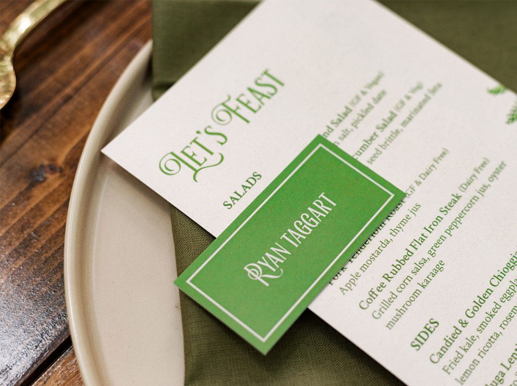
Combining Place Cards and Menus
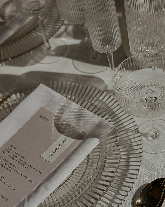
Placement cards don’t need to be their own item on the table. Alternatively, you can integrate them into the dinner menu design either by printing the name directly on the menu or having a separate card that attaches to the menu with a grommet or ribbon. This approach simplifies the table and reduces the number of paper elements.
Dinner menus and place cards are an opportunity to get creative with a piece of your wedding that guests will interact with. For example, you can have an interactive design that swivels open, featuring the guest’s name on the front and the menu on the back.
Coordinating With Your Stationery Suite
A refined wedding design depends on cohesion. Every stationery element should feel connected through shared typography, color palettes, and materials.
Placement cards should echo the same design language used throughout the wedding stationery suite.
When I create a custom stationery collection, I coordinate placement cards with elements such as:
• table numbers
• dinner menus
• seating charts
• reception signage
Guests may not consciously analyze each detail. However, they notice when everything feels polished and thoughtfully designed. This consistency transforms individual pieces into a unified visual experience. Learn more about my stationery and signage packages.
Conclusion
The most memorable weddings feel effortless for guests. Clear guidance, thoughtful design, and smooth service all contribute to that experience. Wedding placement cards quietly support each of these elements.
When you work with me, I design each element with intention. Placement cards integrate seamlessly with all your stationery pieces, your wedding aesthetic, and your tablescape decor to create a unified design story.
If you are planning your wedding and want every detail to feel cohesive and considered, I would love to help. Contact me to begin your custom stationery design.


